")


 (1350 x 1080 px)")
")
The large, executive conference room is quiet as we begin to move through the slide presentation in front of a group of physicians (most of whom I love dearly) and hospital leaders. I know there’s about to be a slide popping up on the big, wall-sized, screen that’s going to infuriate one of the physicians and the room will be quiet no more. He will be fuming because his bar on the chart will look very poorly in comparison to the other physicians in his peer group (who are also in the room). Let’s just say I’m not looking forward to it! And…it all plays out…quickly…just as I knew it would. It was ugly. He yelled. A lot. Slammed his fist on the table and protested the data wasn’t right. Then, he stormed out of the room, slamming the door behind him.
Fast forward six months down the road when we had our next meeting with the same group. The physician mentioned earlier (the super angry one) had the bar with the best outcomes of the group this time. He had left the earlier meeting, cooled off, and immediately made changes in his practice that were clearly evident.
This, right here, is the power of data visualization. This is a story from many years ago and it was my lightbulb moment with data visualization. This was the first meeting where we presented data to physicians in a graphical format, rather than on a spreadsheet. It was alarming. It was meaningful. It was impactful. Gone were the spreadsheet reports forever.
Today, I’m going to break down the three overarching steps to take when using data visualization. (Which you always should, by the way, use data visualization!) We’ll look at identifying your audience and purpose, choosing the right type of visualization, and then designing the visualization. Let’s get into it!
Define Your Purpose

The first step in data visualization is to identify the purpose and audience of the visualization. Common purposes are to convey insights, trends, patterns, or relationships in the data. The audience can be anyone from business executives, physicians, managers, marketing specialists, a general audience, and so many more. Basically, your audience can be anyone who wants to see what’s really going on with their business, organization, or project.
Identify who will be viewing the visualization, so that you can tailor it to them as specifically as possible. The purpose and audience will determine the type of visualization, the choice of data, and the level of detail required.
Choose Your Visualization Type

The second step is to choose the right type of visualization that will best represent the data and effectively communicate the insights to the audience. There are so many different types of visualizations such as bar charts, column charts, line charts, scatterplots, heat maps, infographics, and so many more. Each type of visualization has its advantages and disadvantages. The right choice will depend on the type of data, the purpose, and the audience.
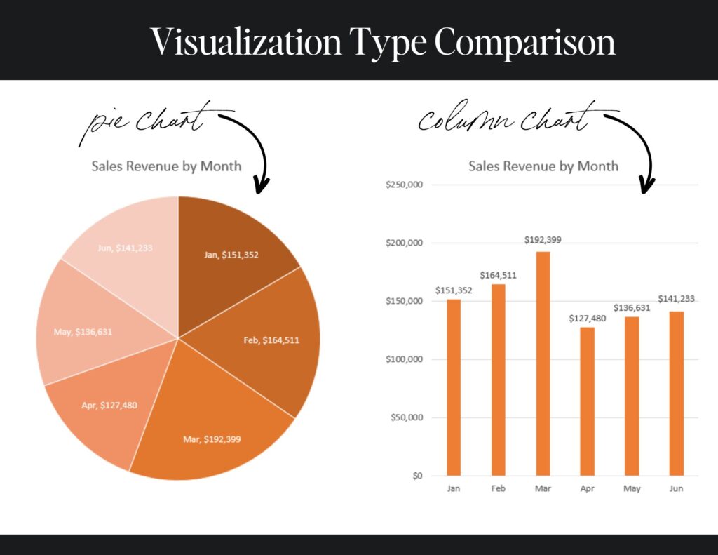
For example, let’s look at a couple of simple charts displaying sales revenues by month. They both display the same information, but you can see that the pie chart on the left doesn’t display the data in such a way that the audience can quickly draw conclusions from it. However, it’s easy to see the variation in sales by month on the column chart on the right.
Design Your Visualization

The third and final step is to design the visualization in a way that is visually appealing, easy to understand, and conveys the desired message. The design elements include the choice of colors, fonts, labels, axes, and other visual cues. It’s important to keep the visualization simple, clutter-free, and intuitive. The design should also be consistent with the purpose and audience of the visualization.
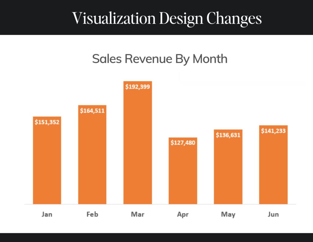
Staying with our example from above, in the chart below you’ll see some changes that clear the clutter. The axis is changed and removed, the gridlines are removed, the data labels are included in the inside end of each column, there are some font size and color changes, and changes to the width of the columns. These changes make the chart much easier on the eye than the one we looked at above, but all the data is still the same. Anything we can do to make the data easier to read and consume is always a good thing!
These are just simple changes on simple charts. The more you use data visualization, the more you’ll learn about incorporating design techniques that can be added to really help move your audience along with you on your data journey.
The Wrap-Up

I hope these tips have been helpful! The next time you’re putting together data, incorporate some of these points and watch your audience come alive!
I put together a checklist for you that will guide you through the ten checkpoints for designing a great data visualization. It’s a great resource to have in your back pocket. Grab the checklist here!
Happy charting!

 (660 × 325 px) (15)")


")


")
